Eye and Ear Hospital
Understanding patient behaviour to design a better user experience
We redeveloped the Royal Eye and Ear Hospital’s existing website making it easier for patients, visitors and health professionals to find relevant health information, patient fact-sheets and clinical services offered by the hospital.
User engagement
Patient journey mapping
Personas
Stakeholder consultation
Website design
User testing
Website development
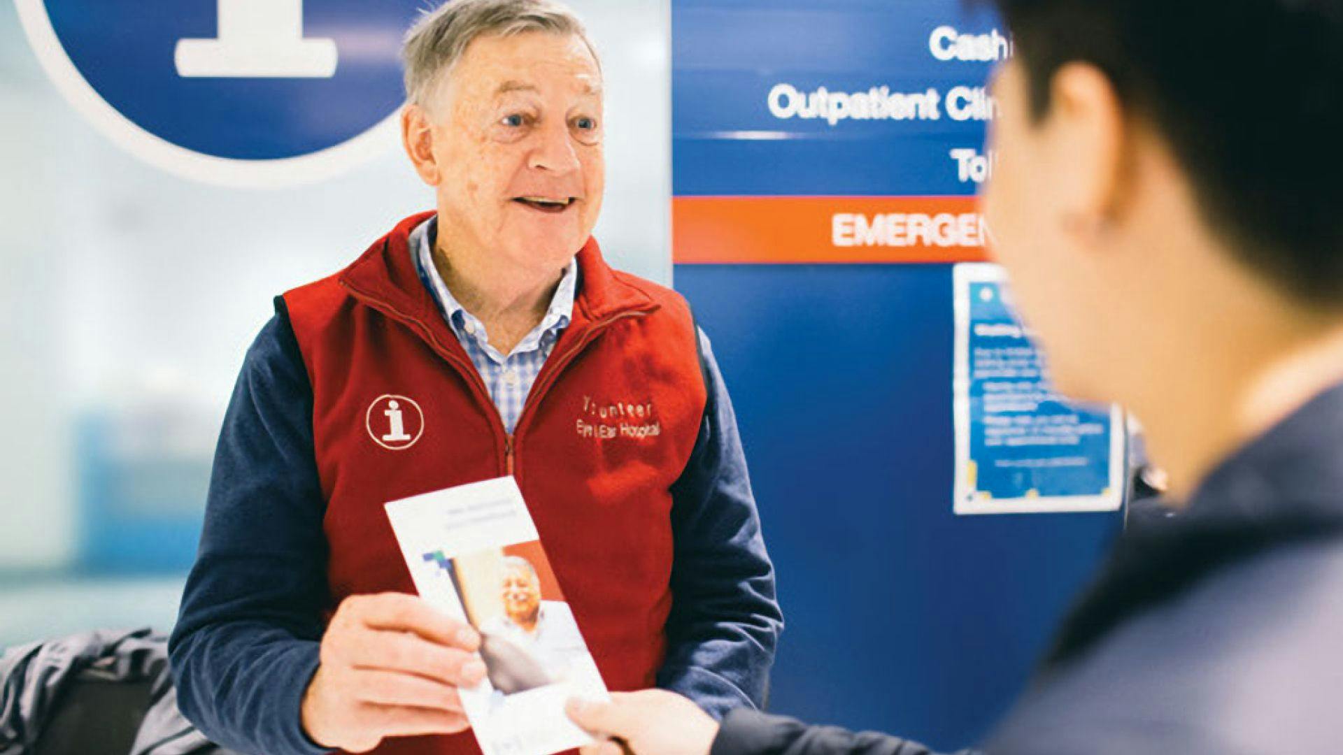

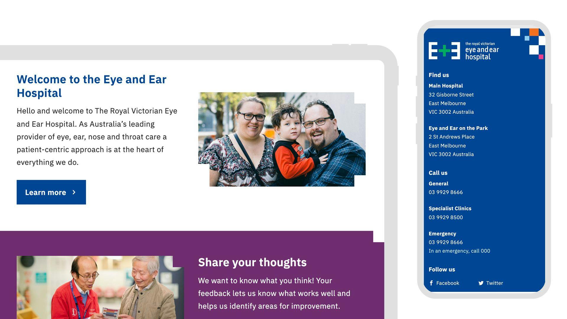
Custom design for a better patient experience
Servicing over 250,000 patients in a typical year the Hospital needed to improve audience engagement and accessibility with the website. We were brought in for our experience using a people-first approach and our ability to undertake a large-scale restructure to implement a custom web solution.
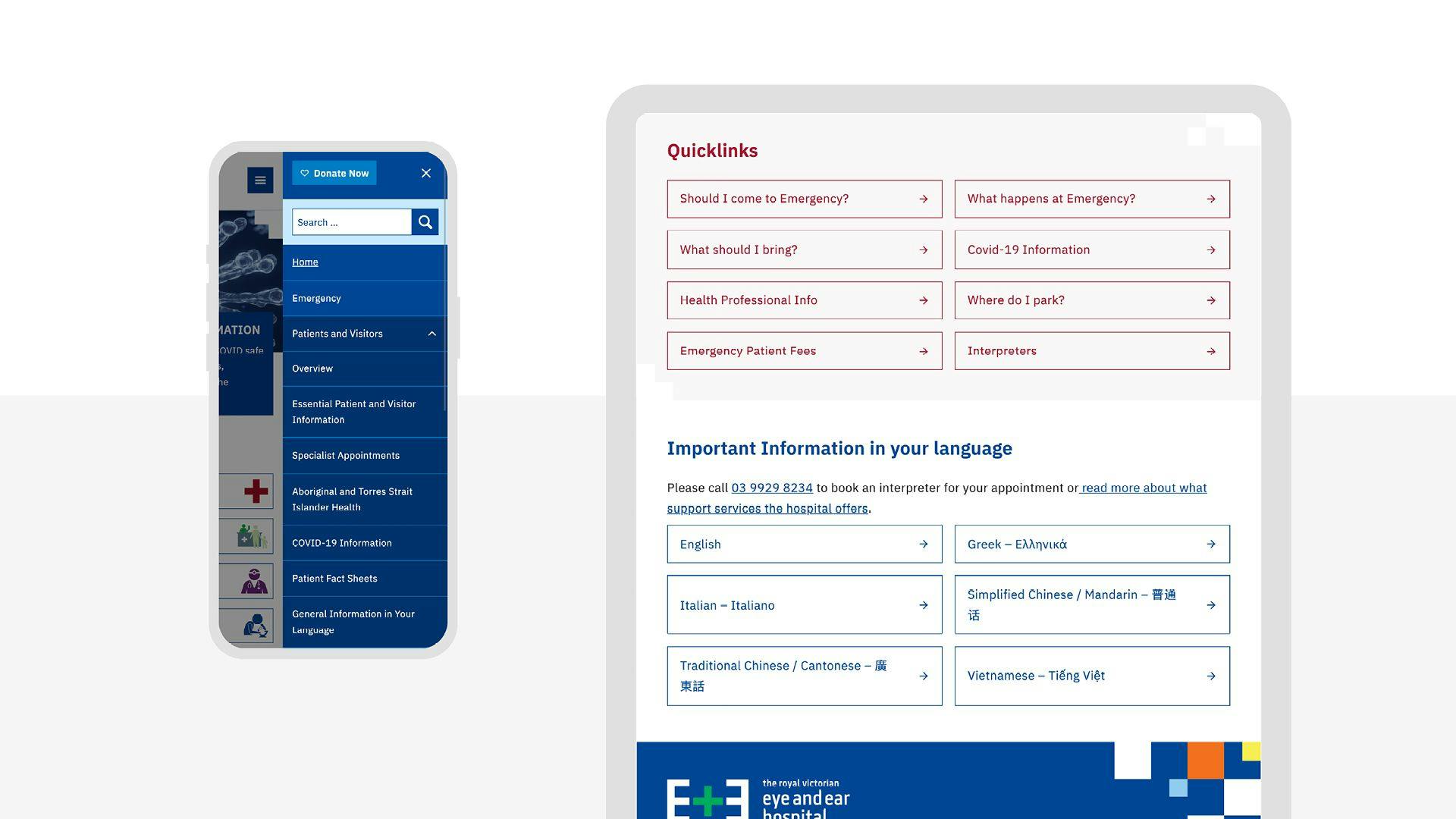
Design for accessibility
Throughout the process we sought regular feedback from the Consumer Advisory Committee. With them, we tested important aspects of the design including the general look and feel, language and terminology for non-English speakers, accessibility for vision impairment or loss, and key information pathways.
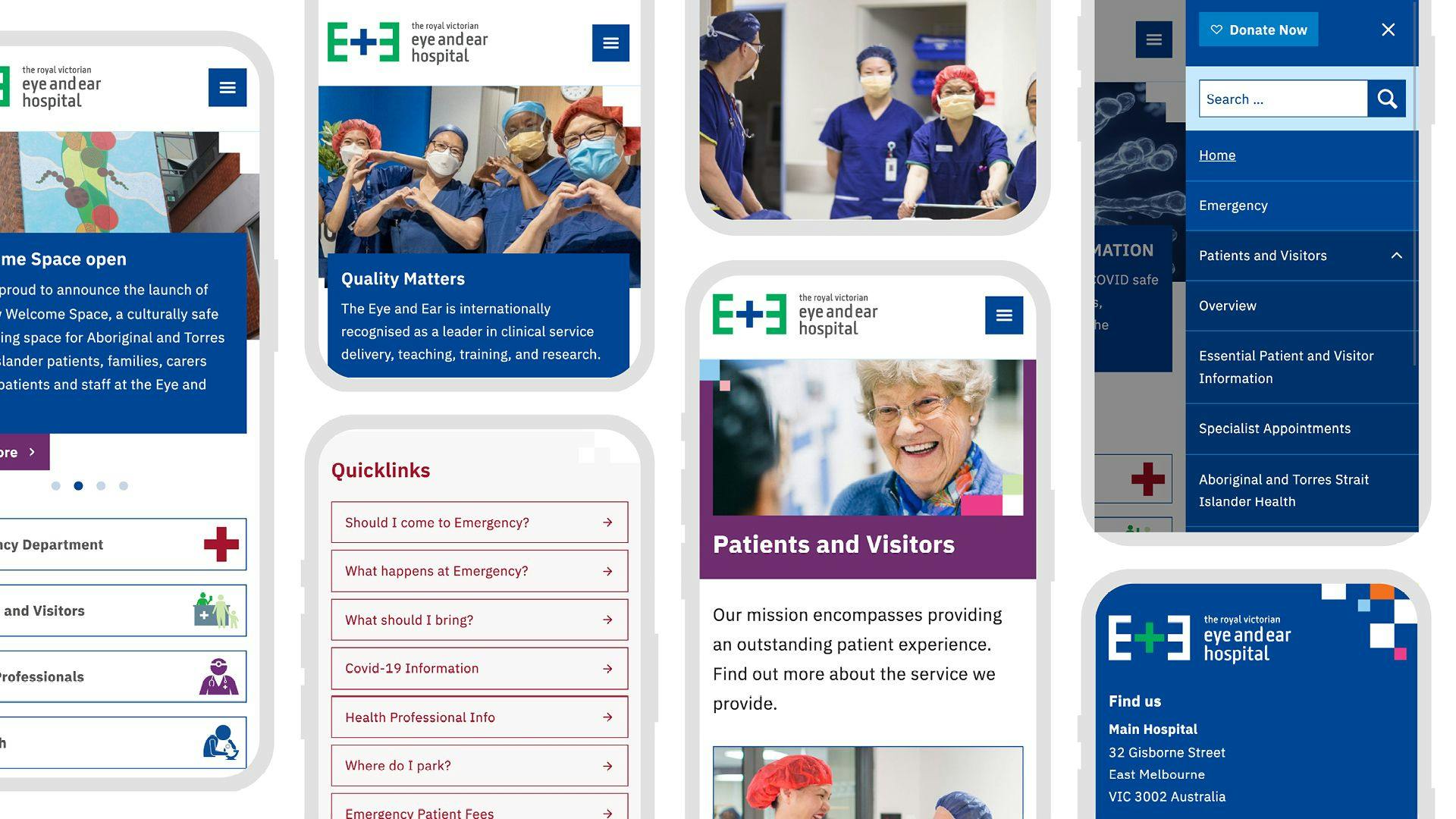


Designing better user pathways
With such a diverse audience using the website accessibility and ease-of-use was always considered. Helpful language, quicklinks and filtered lists were designed to provide a way to communicate and lead patients and visitors to the information they needed quickly and effectively.
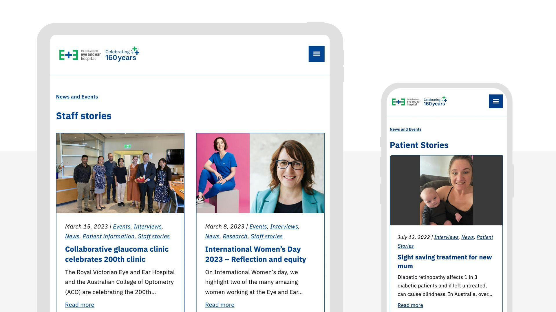
Encouraging engagement and exploration through storytelling
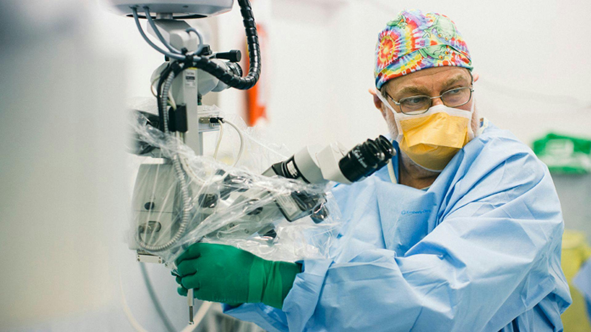
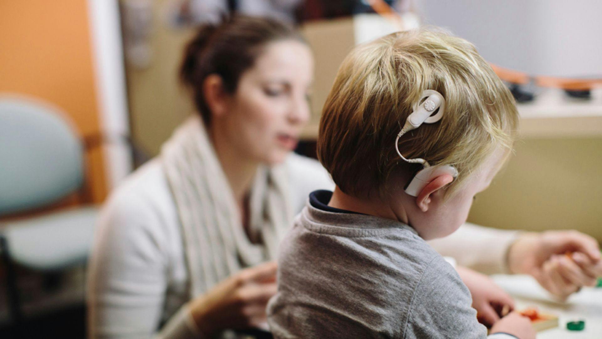
During our research we discovered a wonderful backlog of photography and stories taken for the hospital's Annual Reports. We felt that it was important to have the ability on the website to share and celebrate these stories - to give hope and reassurance to other patients and their families, to celebrate the dedicated and caring staff and to showcase the innovative technology and world-class research that is being conducted at the hospital.
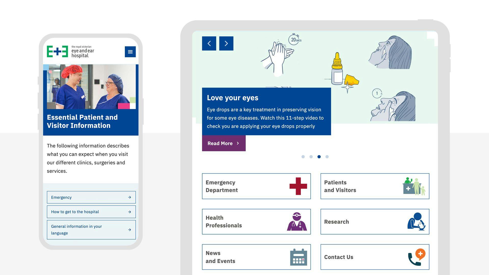
Using data to make an accessible website
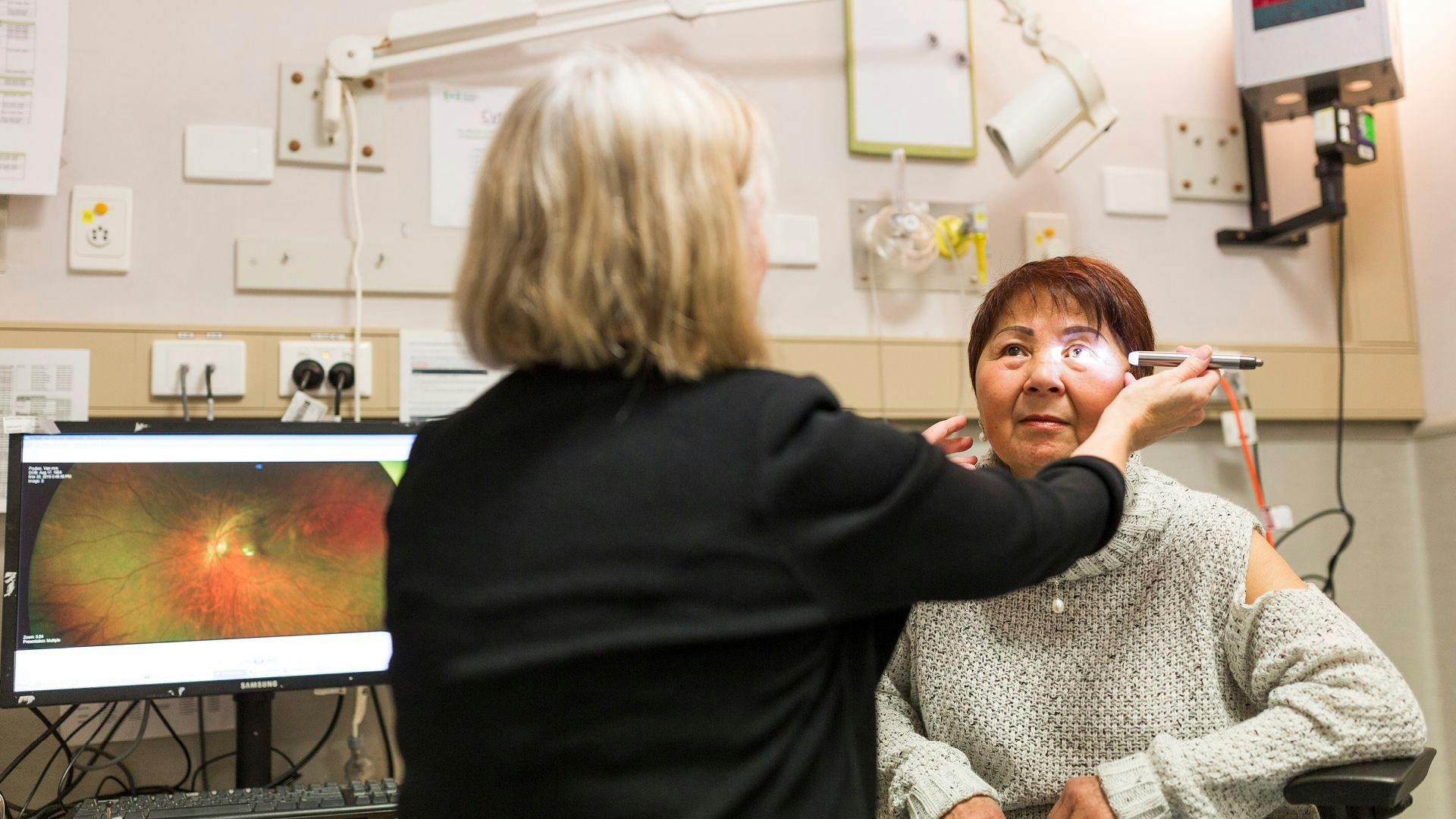
Our analytics showed that some pages were hard to find and unused, yet contained critical patient information. By understanding what patients and staff wanted to know, and how they would look for it on the website, we were able to restructure the website to make all information more accessible.


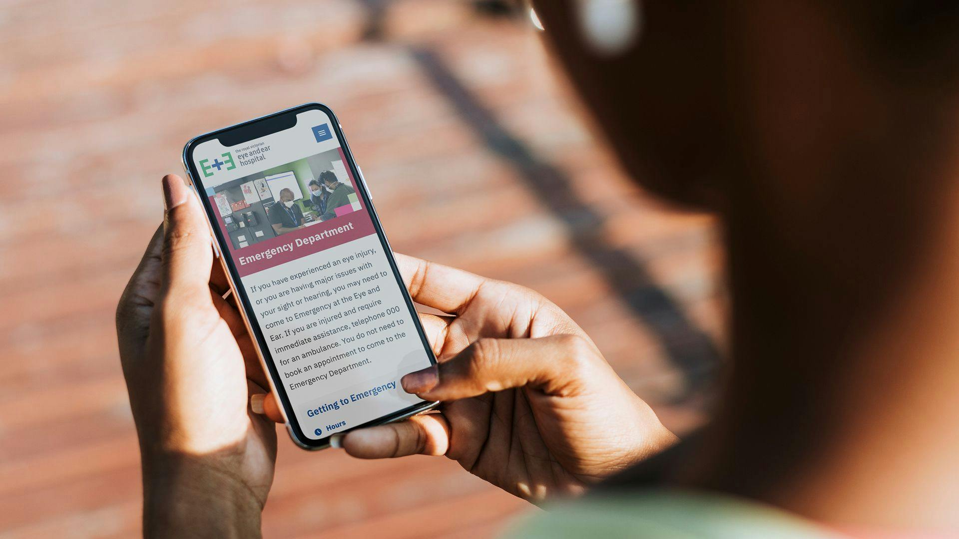
Delivering information quickly, easily and sometimes, urgently.
The Eye and Ear helps over 40,000 emergency attendance patients each year. With such a large number of people accessing this service, we restructured the site architecture to include a dedicated Emergency Department section so that patients were delivered important information to aid their decision making and ease their discomfort and stress.
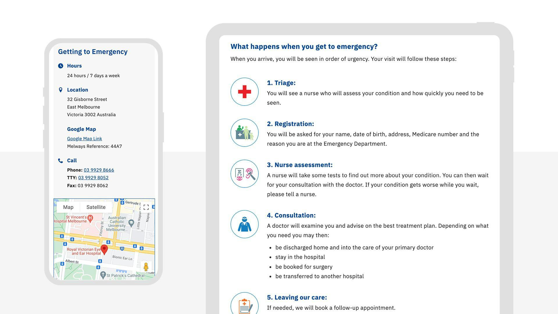
Providing comprehensive information to deliver a better patient experience
New content and features to aid patients understanding included information on what is considered an emergency and alternative care if appropriate, a step-by-step visual guide of the expected patient journey and practical information on location and parking and facilities at the hospital such as wi-fi, toilets and location for food and beverage options.
Testimonial
"Website accessibility was a priority for us and it was always front of mind in any recommendations they made."
Joanne Brodie
Marketing and Communications Manager
“Sixheads provided a great service during our transition to a new website. They conducted a number of stakeholder interviews as part of the process to ensure they had a thorough understanding of our requirements. Website accessibility was a priority for us and it was always front of mind in any recommendations they made. The team is responsive and continues to provide excellent ongoing support.”
