Miscarriage Australia
A human-centred design approach to creating a brand and website that positively impacts people affected by miscarriage.
Miscarriage Australia is a not-for-profit organisation that provides acknowledgement, advocacy, information and support to those affected by miscarriage in Australia.
Brand strategy
Brand identity
Brand guidelines
Accessibility
Web design
User Testing
Web development
Build strong, sustainable brand recognition
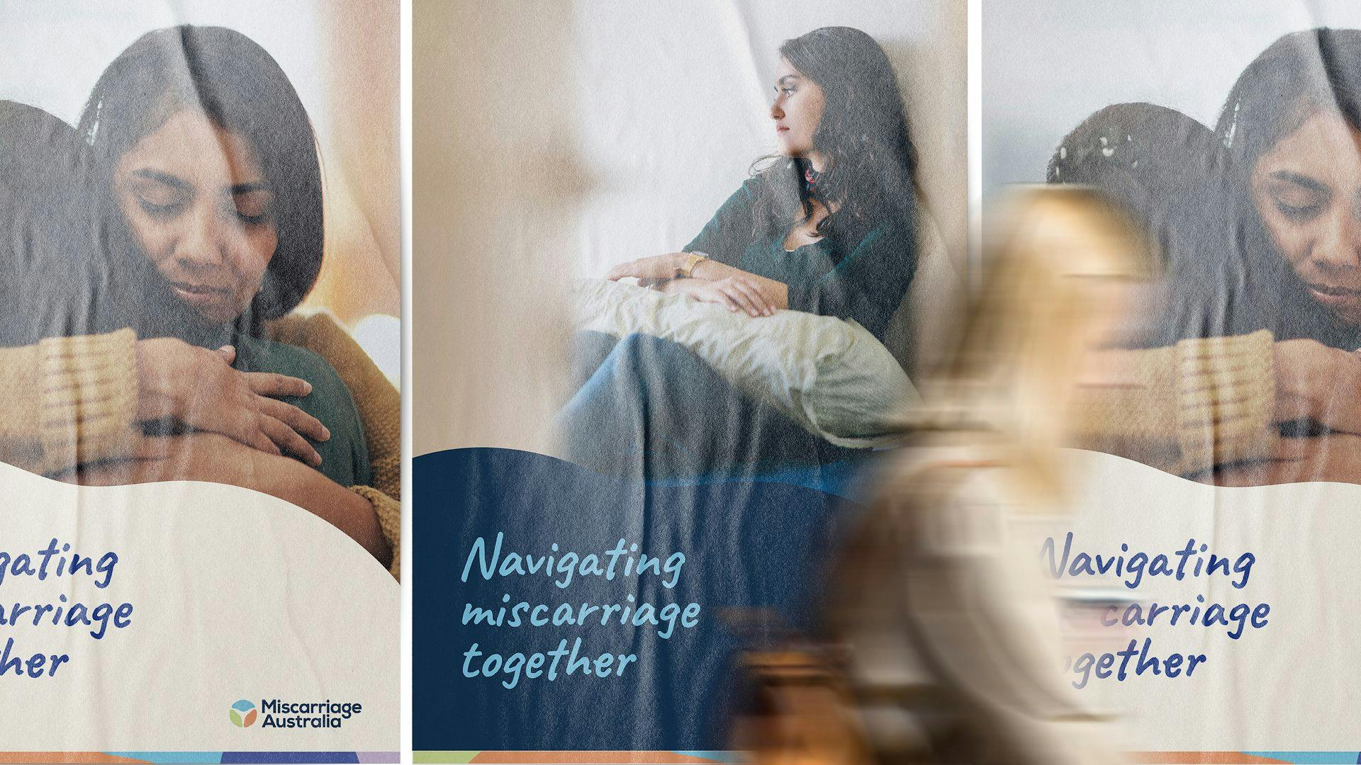
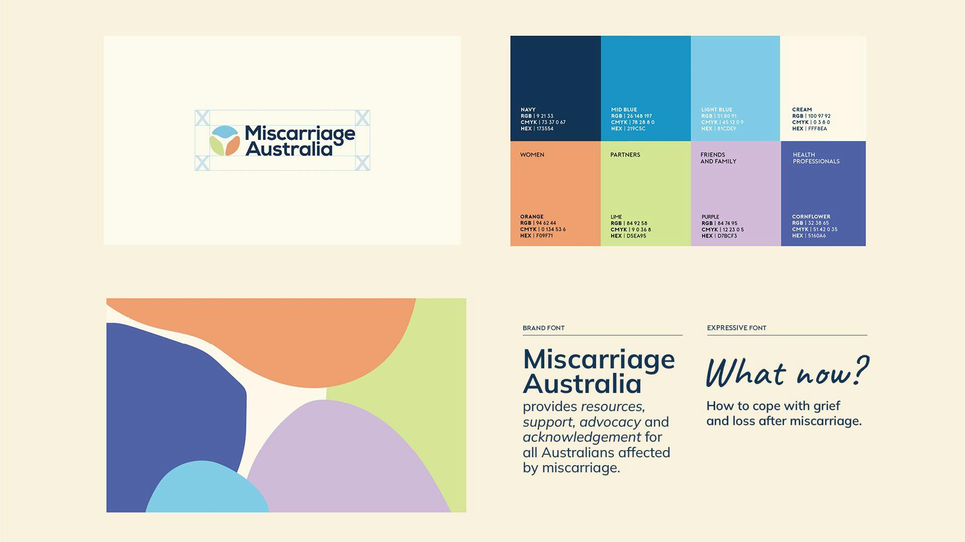
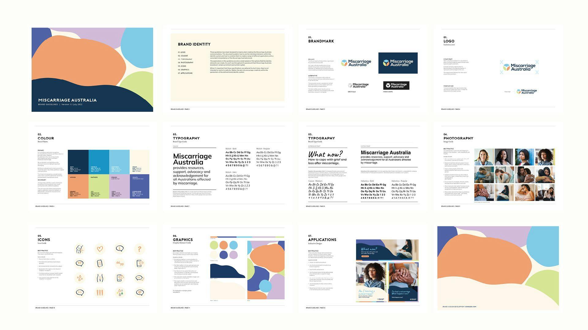
Consistency - over platforms and years - is key to building strong brand recognition. So we created a comprehensive brand system with detailed guidelines to support the Miscarriage Australia team in managing the brand. This included guidance on how to combine the brand assets to create engaging and consistent content across their communications, now, and in the future.

Understanding who you’re designing for
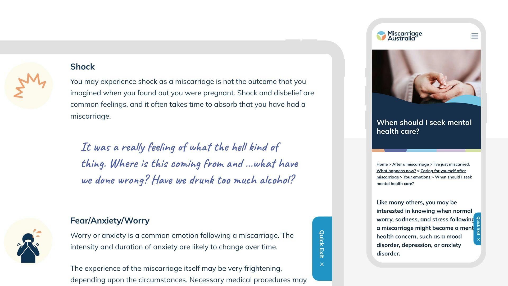
Our goal was to create a brand personality that was warm, calm and relatable but also felt authoritative and gave a sense of reassurance. To ensure we achieved that, we conducted user testing with women from around Australia who had lived-experience with miscarriage. This critical step in our design process enabled us to determine if the visual identity was sensitive and appropriate, and helped avoid making assumptions about what users wanted.
Testing the usability, functionality, and overall user experience
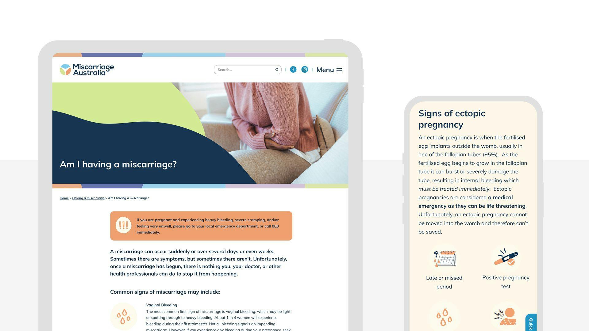
A critical step in any design process, user testing helps us, and the organisation we represent, avoid making assumptions about what users want. We recruited participants from all over Australia to navigate the website and provide verbal feedback on its content, layout, and design. We also asked about their personal experiences with miscarriage and how they felt the website addressed those experiences.

“There is a difference between this and other websites I’ve looked at. This feels a lot more like it’s been created by people that know, have experienced it and gone through [miscarriage]. This feels a lot more relatable”
Feedback from user testing

Make it accessible when users need it the most
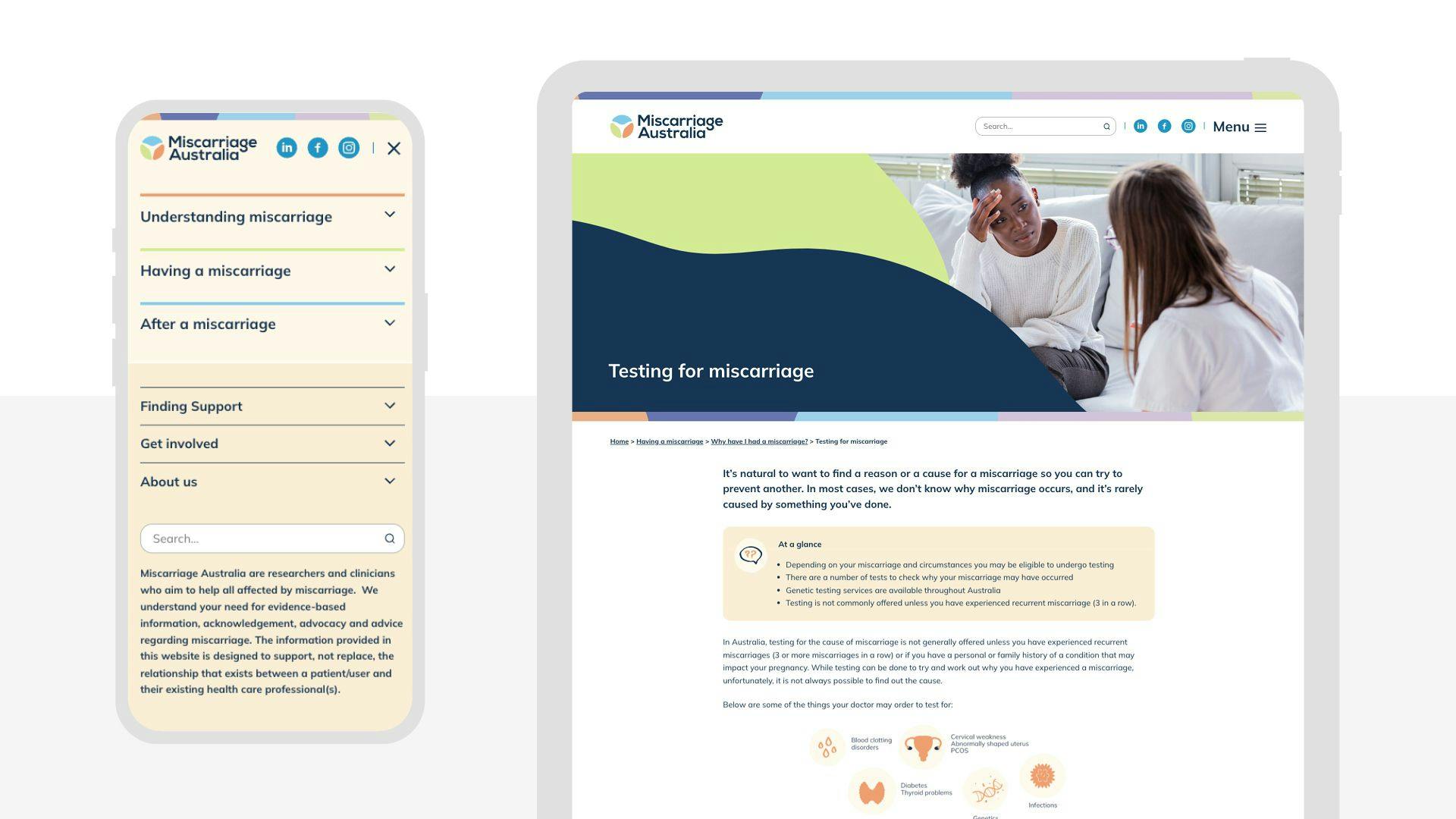
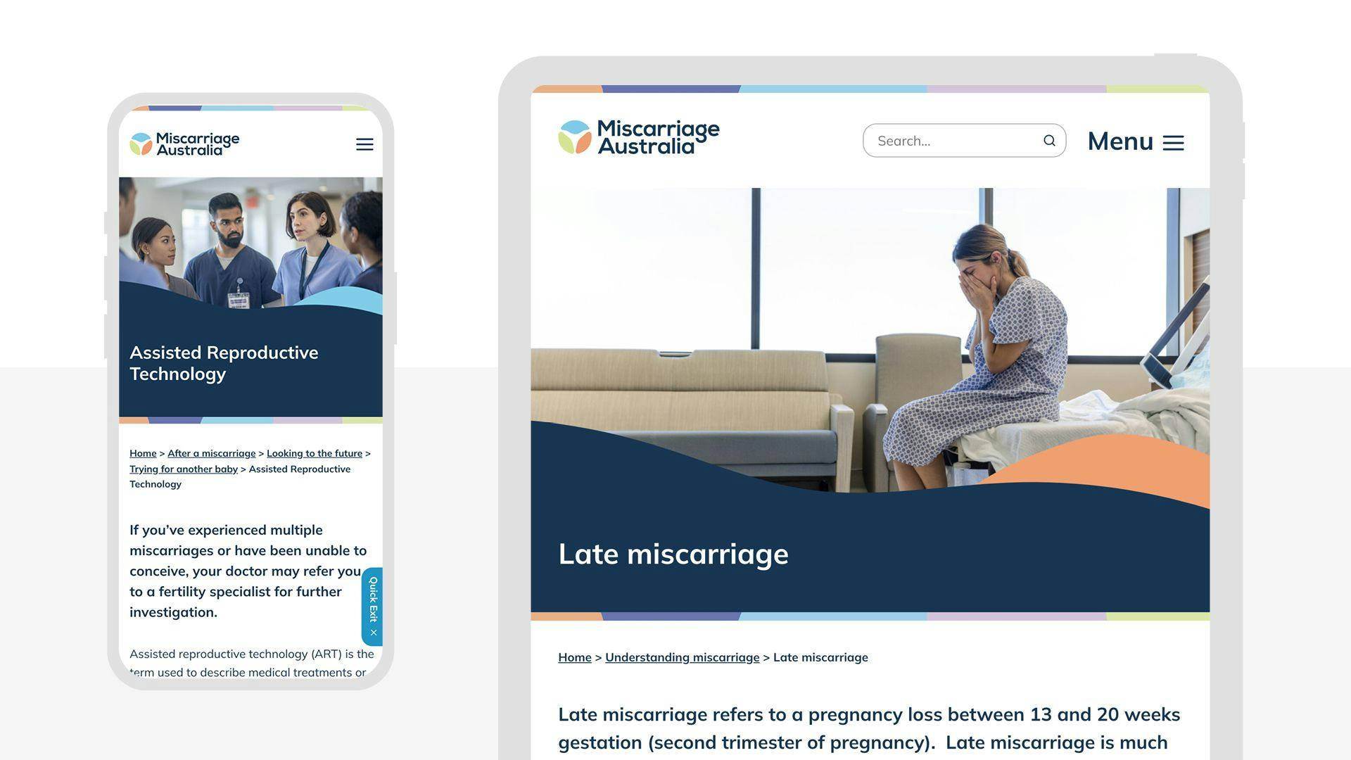
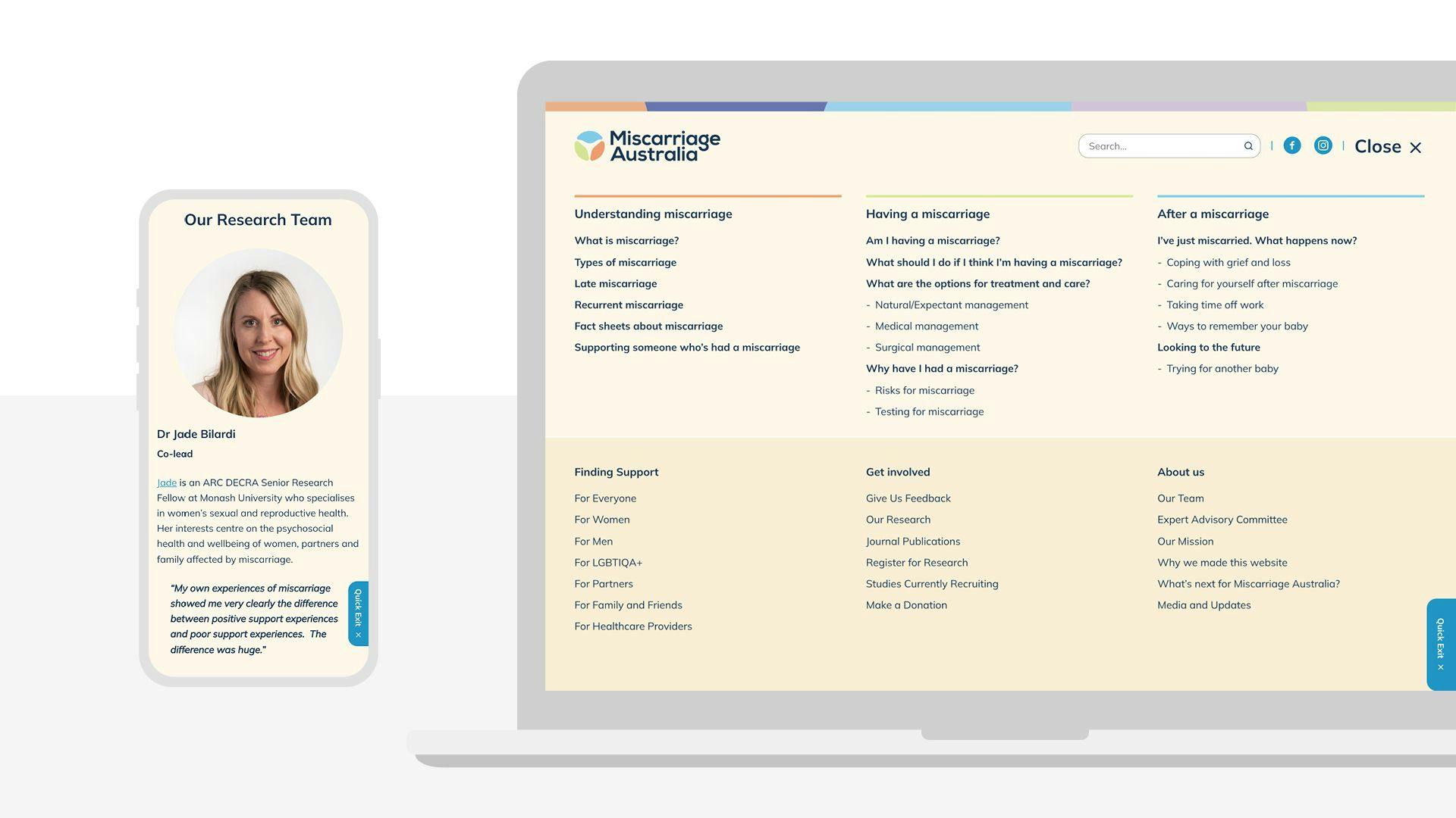
User testing let us know that women would often access information and support via their mobile during urgent care or vulnerable situations and this was crucial in helping those affected by miscarriage feel less isolated, more supported and more informed of their health care options. So it was essential that the website considered good mobile experience, and this was prioritised in our design and development.
Testimonial
“They went above and beyond, and we are absolutely rapt with the end product.”
Jade Bilardi
ARC Decra Senior Research Fellow | Co-Lead, Miscarriage Australia Program
“Our team had the pleasure of working with Sixheads to develop the branding and build of our website, Miscarriage Australia. We would highly recommend Sixheads to anyone looking for branding and website design. Professional, adaptive, responsive, creative, patient with us as novices in this area and really genuine in wanting to make our website look fantastic and function well. They went above and beyond, and we are absolutely rapt with the end product. The back end is extremely user friendly making it easy for us to make future changes and additions to the website independently. We genuinely hope we get the opportunity to work with John and Bec again in the future”.
